

New Logo
App
Research
Benchmarking
After conducting a competition analysis, I discovered that one competitor, Associação das Farmácias Portuguesas, had a mobile application.
User Interviews
I interviewed six people from the target group.
Questions:
1. How often do you go to a pharmacy?
2. What kind of products do you usually buy?
3. When do you get a chance to go the pharmacy?
The key insights I got from these interviews were:
1. People would shop at their free time, such as in the evenings and at night.
2. It would be convenient to buy the product online and then pick it up at the pharmacy.
3. An app would be useful for chronic medication since it would give the user some control over their treatment.
Problem Statement
Those who buy online want a speedy shopping experience, including an easy search and ordering process. Additionally, those who buy chronic medication do not want to worry about running out of medicine.
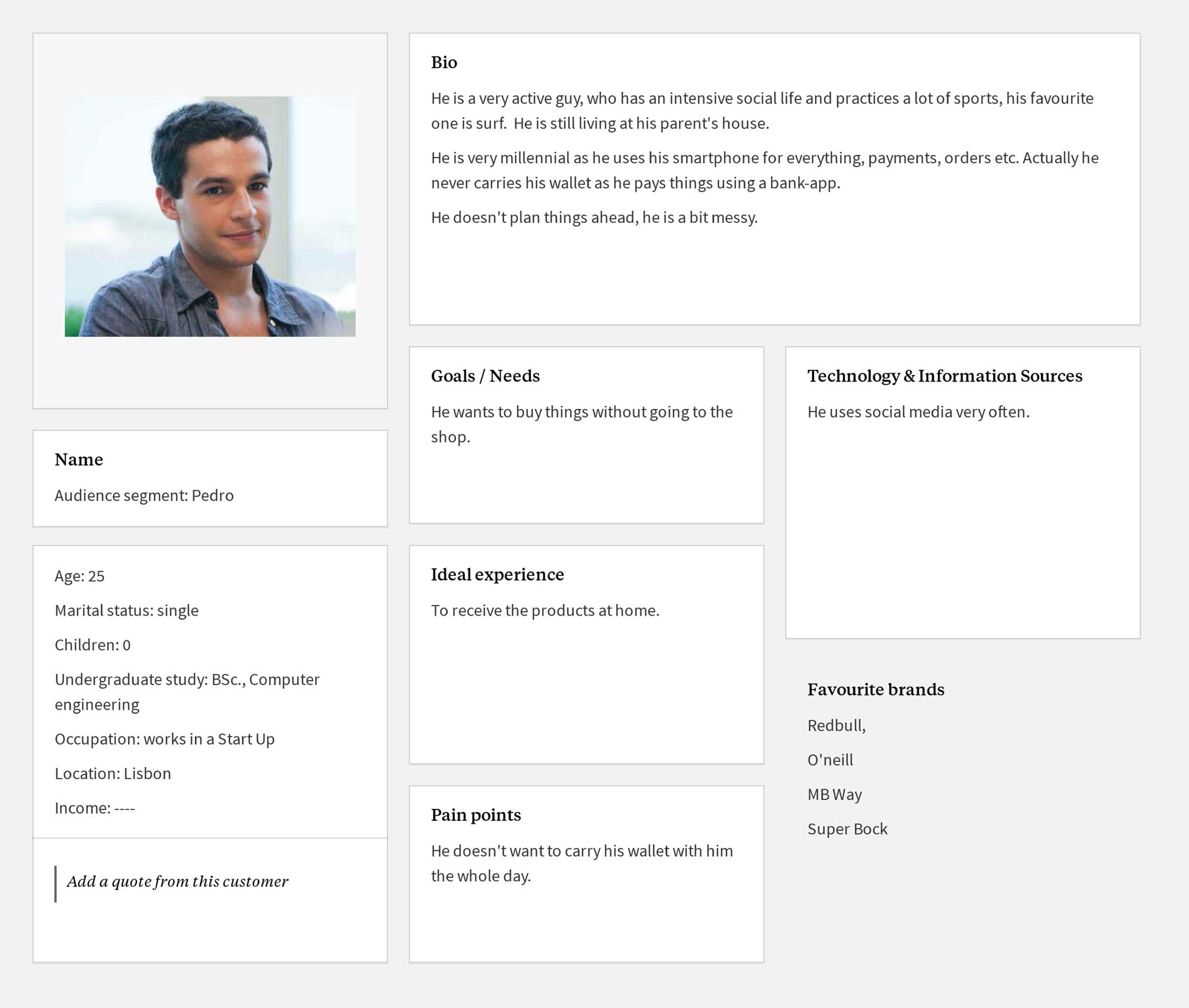
User Personas
After the interviews I consolidated the insights into three user personas. An example as it follows.
Journey Map
I sketched out the user personas and how they would interact with the app.

User Flow
I outlined three user flows based on the personas and their journeys:
- Ordering a prescribed medication.
- Adding a reminder for a chronic medication.
- Ordering a non-prescribed medication.

Early Sketches
The first screens and the additional user flows were sketched using Balsamiq.
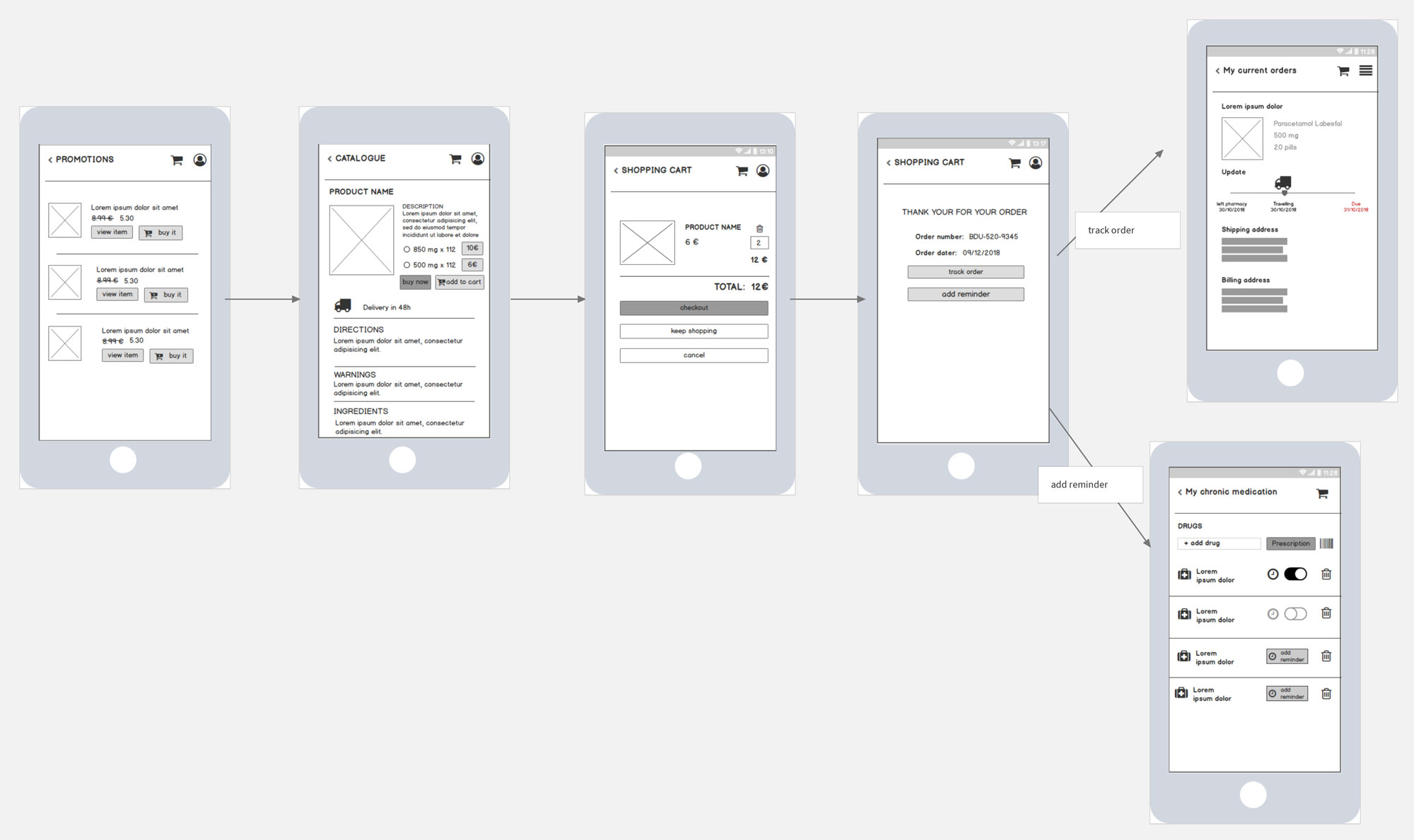
Prototype & Testing
I produced a low-fidelity prototype in Invision utilizing the screens created in Balsamiq. I tested it with the client and future users and incorporated their suggestions to improve the user experience. An example of this is the ‘online doctor’ service. The customer felt that the online doctor feature prevented users from contacting the business directly, which went against the app’s intended goal. As a result, I had to remove it.

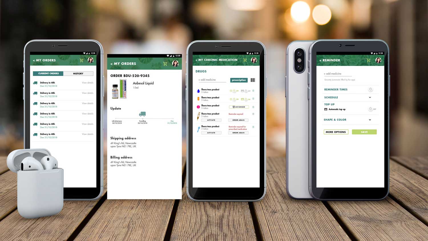
In relation to the chronic medicine, I also modified my strategy. One of my earliest ideas included a ‘my medicine schedule’ feature where users could add a top-up for an automated order and set notifications for their medications.

During testing, I discovered that consumers wanted these features to show up following a purchase.

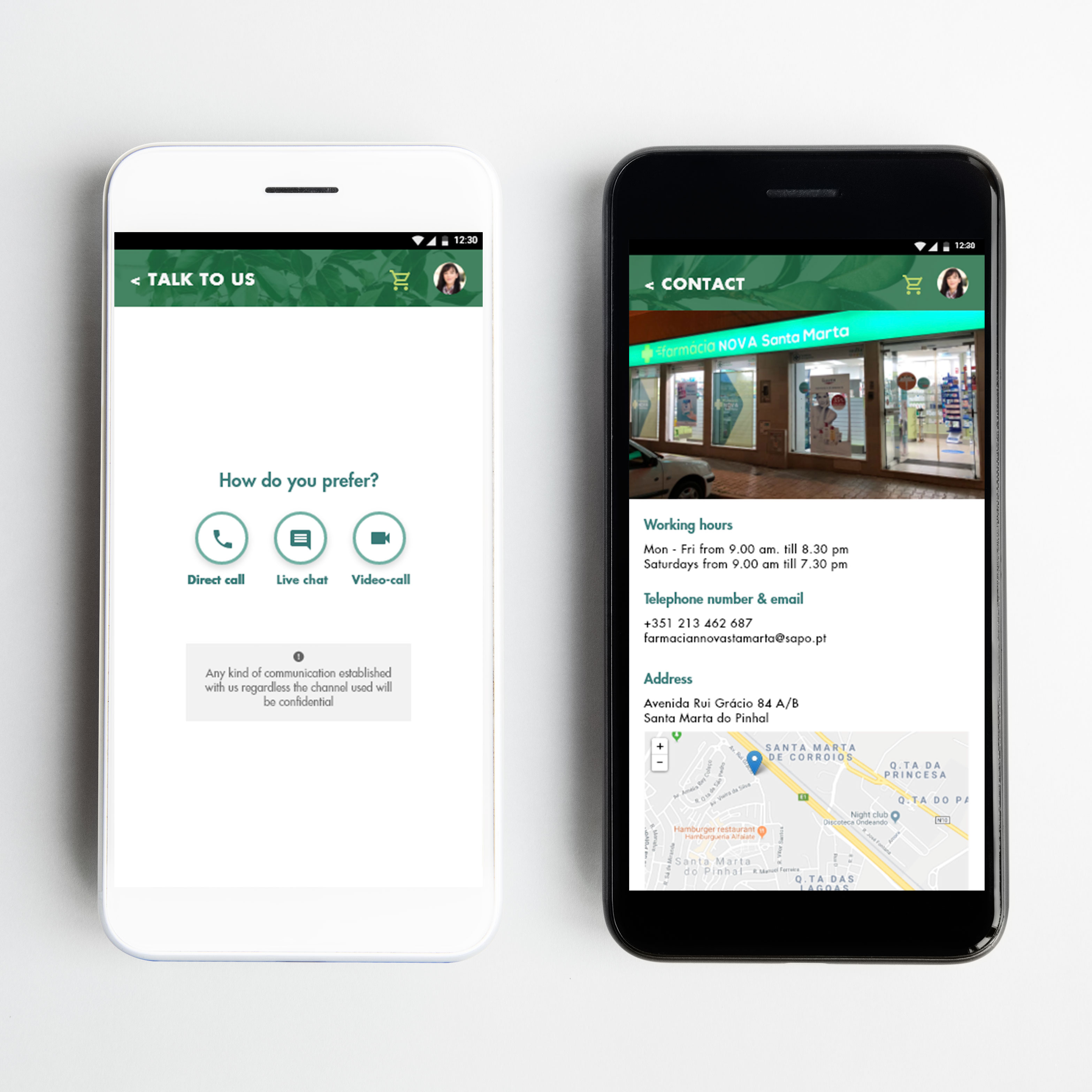
To better serve users, I divided the homepage into short cuts (e.g., prescription, reminders) as they were often the first things they looked for when opening the app. The pharmacy prioritizes ‘Talk to us’ as the most significant element on their homepage.

Visual Design
Since consumers nowadays trust natural and herbal items, I built the design on pictures of plants and the nature. It also served as a subliminal reminder to consumers of the origins of pharmaceutical items. I also added icons to make it more intuitive.
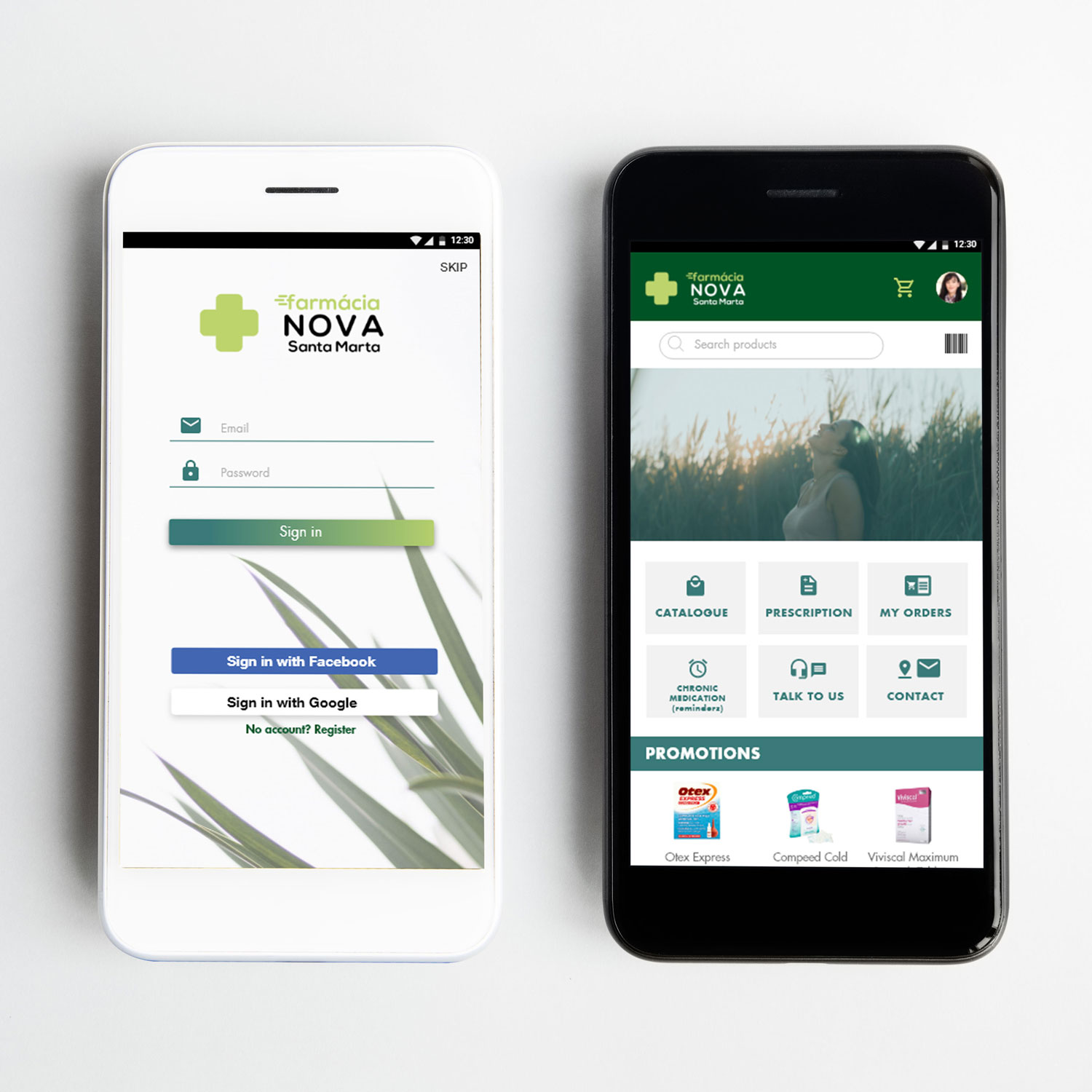
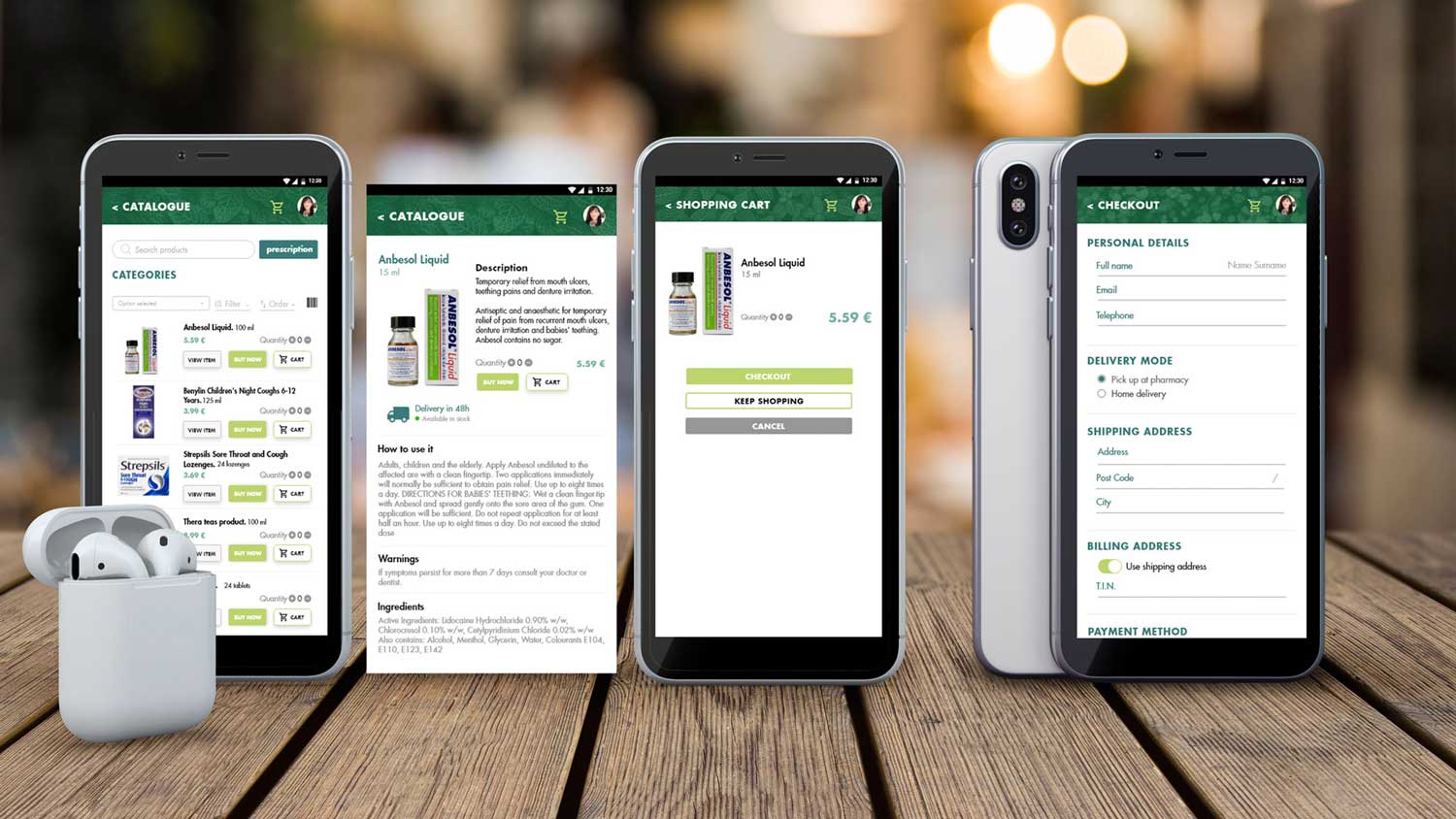
Final Mockup
The screens from my final design prototypes.